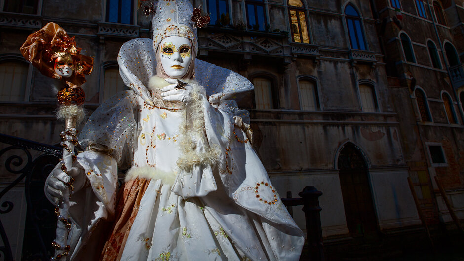
Venice Carnival #4

As I mentioned in the previous post, I wanted to post one more shot of this performer and costume. I think this one is even more dramatic.I used this image for one of the critiques, and there was a lot of debate about the window on the top right corner, and if it should be made blue like the others. I shot and included the image on purpose while I was making this image, as I thought it added an interesting dynamic. David thought otherwise, Bobbi agreed. In the end, it was left up to me, and I've decided to keep it. It is yellow because it was catching the reflection of the sun from other windows. Contrary to what this image looks like, it was late afternoon, but not yet dark, when this photo was made.This was also shot with a grid spot in manual mode. Settings are basically the same as the previous shot, just from a wider angle and a somewhat different pose. Processing wise, almost identical as the previous shot, but I did darken the background a bit more from the original shot.Hope you like it, let me know which one you prefer and why.
