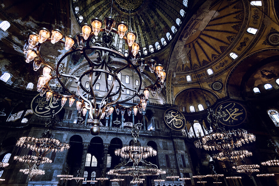
The interior of Hagia Sophia (Ayasofya) - Istanbul

According to many Hagia Sophia, is the prime example of Byzantine architecture. We made it to Hagia Sophia on our first full day in Istanbul and manage to beat the lines by purchasing a Museum pass which you can find just next to the main entrance being sold from a mini-van. Once inside, the grandor and history of the mosque/church was all around us. It looks old, and I was a bit surprised but how some of it looks so rundown, but I guess that is what time does.Hagia Sophia as a long history, and particularly impressive are the early 13th century mosaics on the second floor. Many of them were covered for hundreds of years due to its conversion to a mosque. Also impressive to me, and the subject of this photograph, are the chandeliers on the main hall and throughout the building. You can't see it here, but they are just above your head as you walk about.From a photograph perspective, this shot was made at ISO 800 at f4. I'm continuously impressed at how good the files out the Canon 5D Mark II are. I purposely composed the people out of the shot, and had to skew the right bottom corner a bit in Photoshop to remove some of the heads that poked out, and align the image a little bit. During post, I applied individual curve layers for each major section of the interior. I then used a black and white layer to de-saturate the image, and brought some of it back on the lights of the front most chandelier. I then toned the image slightly with another curves layer, and finaly added a vignet.Let me know what you think, more to come.P.S.: The Museum card is only worth it to by-pass the lines, I wouldn't recommend it much for the rest of the access it gives you for the price, but have a look if you ever go it might make sense to you.
